Confidential client deliverable · Enter the passcode you were given
Imagine Wireless · Powered by OoklaConfidential
MIA · Deep Edition
Venue Network Intelligence Report · Deep Edition · rev 2
How wireless actually performs at Miami International.
An independent, measurement-grounded read on the airport's in-building cellular, Wi-Fi, and
private 5G: characterized gate by gate and tenant by tenant, and framed to the open Miami-Dade DAS procurement.
129
Gates measured
494
Tenants measured
3
Carriers · T-Mobile · Verizon · AT&T
~80.8K
Ookla tile aggregates
Prepared by the Imagine Wireless Network Intelligence Platform · Powered by Ookla
Data window 2025-04-01 to 2026-03-31 · Issued 2026-05-26 · Rev 2 (VNIR standard) 2026-08-11 ·
Rev 2.2 (rev-2 data parity + corrections) 2026-08-14
Data 57 days fresh at original issue, 136 days at rev 2.2 — beyond the platform's 90-day default. This
revision re-states and corrects on the same data window; it is not a data refresh.
Confidential
Section 1
Executive readout.
Strongest indoor first
MIA runs three carriers, an airport-owned Wi-Fi network, and an active private 5G system, all sitting
under a competitive procurement that will replace the dominant in-building cellular system with a neutral-host
design. We measured the venue at gate, tenant, zone, band, and per-carrier serving-cell resolution. Three
findings hold across every cut of the data.
T-Mobile
The strongest 5G signal strength in the building, which matches its position as lead carrier on the
attested DAS. It is also the most interference-degraded carrier on quality, with the most unstable serving-cell
behavior. The DAS contract expired in 2024, and the data reads like a system that has not been re-tuned through a
contract cycle.
Verizon
The cleanest signal quality of the three, and the best 4G fallback at 128 of 129 gates, with no
distinct in-building path of its own recorded in the airport graph. The pattern is consistent with a legacy
standalone system, exactly the class of asset the procurement contemplates retiring on cutover. Worth finding and
documenting before award.
AT&T
On the record, not in the measurement. The DAS record describes a T-Mobile-led carrier consortium
KG · 0.8, which puts AT&T on the system on paper. The measurement disagrees with the
paper: AT&T's signal drops 11.4 dB crossing the building skin, and its 5G sits in the at-risk band at 122 of
129 gates. If AT&T is hosted on this DAS, that path is not delivering, and the procurement baseline should
treat AT&T as remediation with a named root cause, not as a working carrier to carry forward.
Why the order holds
The carrier order above is itself a finding. T-Mobile leads the attested DAS and leads on indoor strength.
Verizon shows the signature of an independent legacy path. AT&T, consortium attestation notwithstanding, measures
like a carrier fed from outside the building. Deployment history explains the measurement; the measurement tests
the deployment record.
The reassuring fact
No 5G gate at MIA sits in the critical band on any carrier. Service is not structurally lost anywhere. Every
carrier reaches effectively universal 4G, so a passenger keeps a usable signal even where 5G thins. The work
ahead is lifting quality and closing the indoor gaps, not rescuing dead zones.
Why this matters now · the open MDAD procurement
The published scope is a neutral-host converged DAS: a ten-year term plus a five-year option, naming all
three carriers, including CBRS private wireless, and decommissioning legacy in-building systems on cutover. The
measurement record gives MDAD a baseline to write requirements against, and Section 14 turns that baseline into
an acceptance-criteria table.
MIA is a large hub run by the Miami-Dade Aviation Department on a 3,230-acre county site, and the
second-busiest US airport for international passengers. Here is the wireless environment as the data and the
airport records describe it today. Airport-record facts carry an inline tag naming the source and its recorded
confidence; measurement figures keep the original data window.
Element
Value
Notes
Airport
Miami International · MIA / KMIA
Miami-Dade Aviation Dept (MDAD); FAA large hub; 55.3M passengers (2025) · 26.6M enplanements KG record
Technology decision-maker
Maurice Jenkins
Chief Innovation Officer, MDAD KG · 0.8
Concourses · gates
6 concourses · 129 gates
D · E · F · G · H · J. Largest cluster: Concourse D, 51 gates, American hub
The July 2026 registry reconciliation records a carrier consortium, T-Mobile lead KG · 0.8; the earlier registry said single-carrier. Contract expired 2024; managed by Black Box; in scope for replacement. The measurement shows only T-Mobile with an indoor signature (Section 3)
DAS manager / 24×7 NOC
Black Box
Telecom managed-services partner at MIA since 2004
Wi-Fi network
Airport-owned · Boingo
Passpoint enabled (corroborated 2026-05-12); observed at 96–100% of tenants
Private 5G
FutureTech / Black Box
Joint active contract on CBRS, active since 2024 KG · 0.8; coverage zone and use cases not yet recorded
Open procurement
MDAD DAS solicitation
Neutral-host converged DAS · 10-year term + 5-year option · names all three carriers · includes CBRS · retires legacy systems on cutover · still out to bid as of August 2026 KG record
Airline footprint
21 hubs · 12 station carriers
American primary hub (Concourse D); Latin-American carriers (Copa, Avianca, LATAM, Aerolineas Argentinas) on Concourse J
Comparable measured venues
SEA · ONT
Same platform, same threshold ladder, same method standard (Section 16)
How to read the measurement
Every figure traces to the Ookla tile dataset, summarized onto gate polygons from OpenStreetMap and tenant polygons from Google Places. Ookla documents bin geometry at roughly 10 × 10 meters, elongating away from the equator; earlier editions of this report stated ≤ 50 m, and the standard resolves to the documented value. The view is outdoor and gate-area aggregated, so jet bridges, the below-grade people-mover, and baggage corridors are out of scope until a walk-test layer is added.
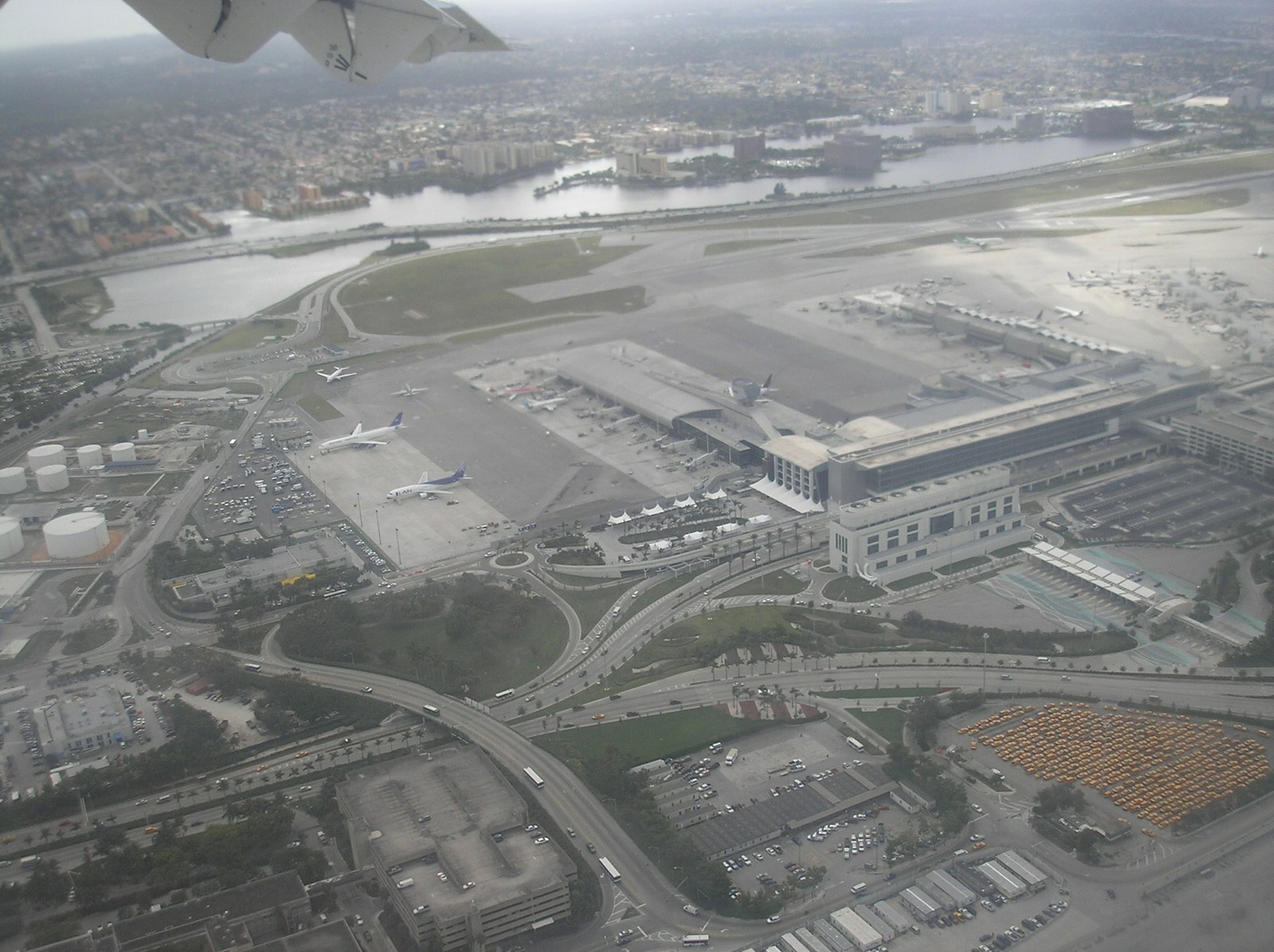
Photo · Miami International from the air, 2007Wikimedia Commons
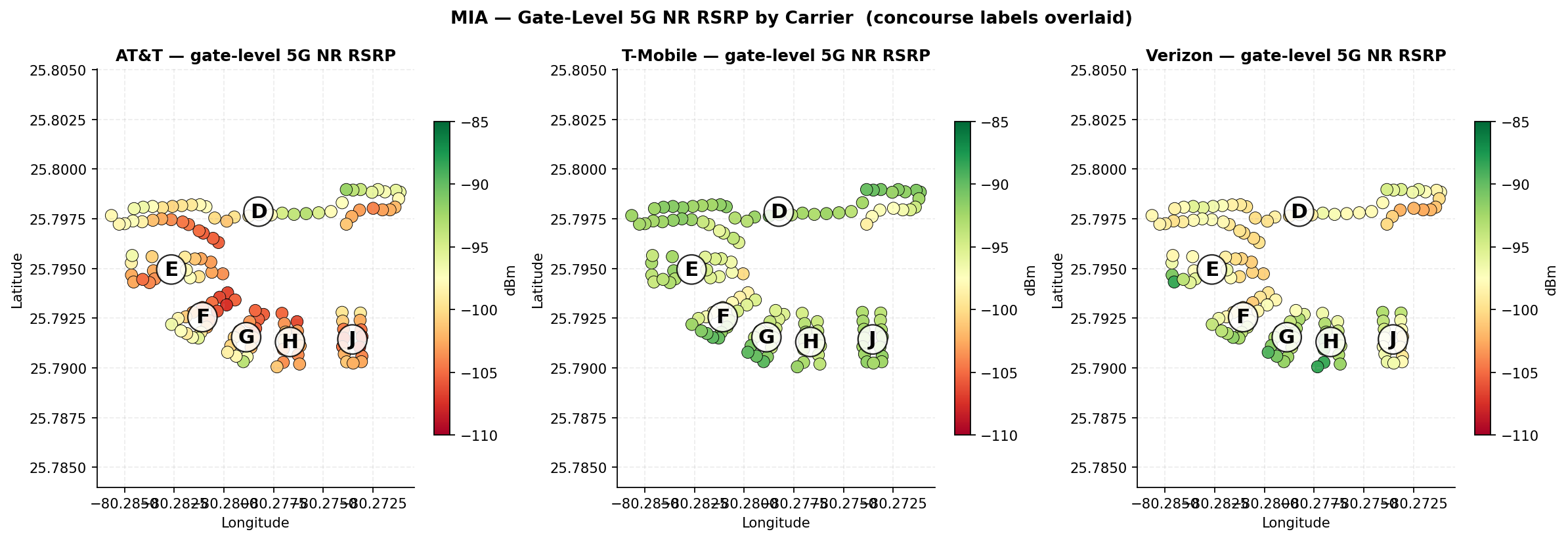
Fig. 10 · Gate-level 5G NR RSRP by carrier · concourses D–J labeledSource · Ookla
Each dot is a measured gate position colored by that carrier's 5G NR RSRP within the gate buffer; concourse letters mark the piers. Same data window as the report (2025-04-01 to 2026-03-31); figure from the sealed rev-2 Carrier Comparison Report.
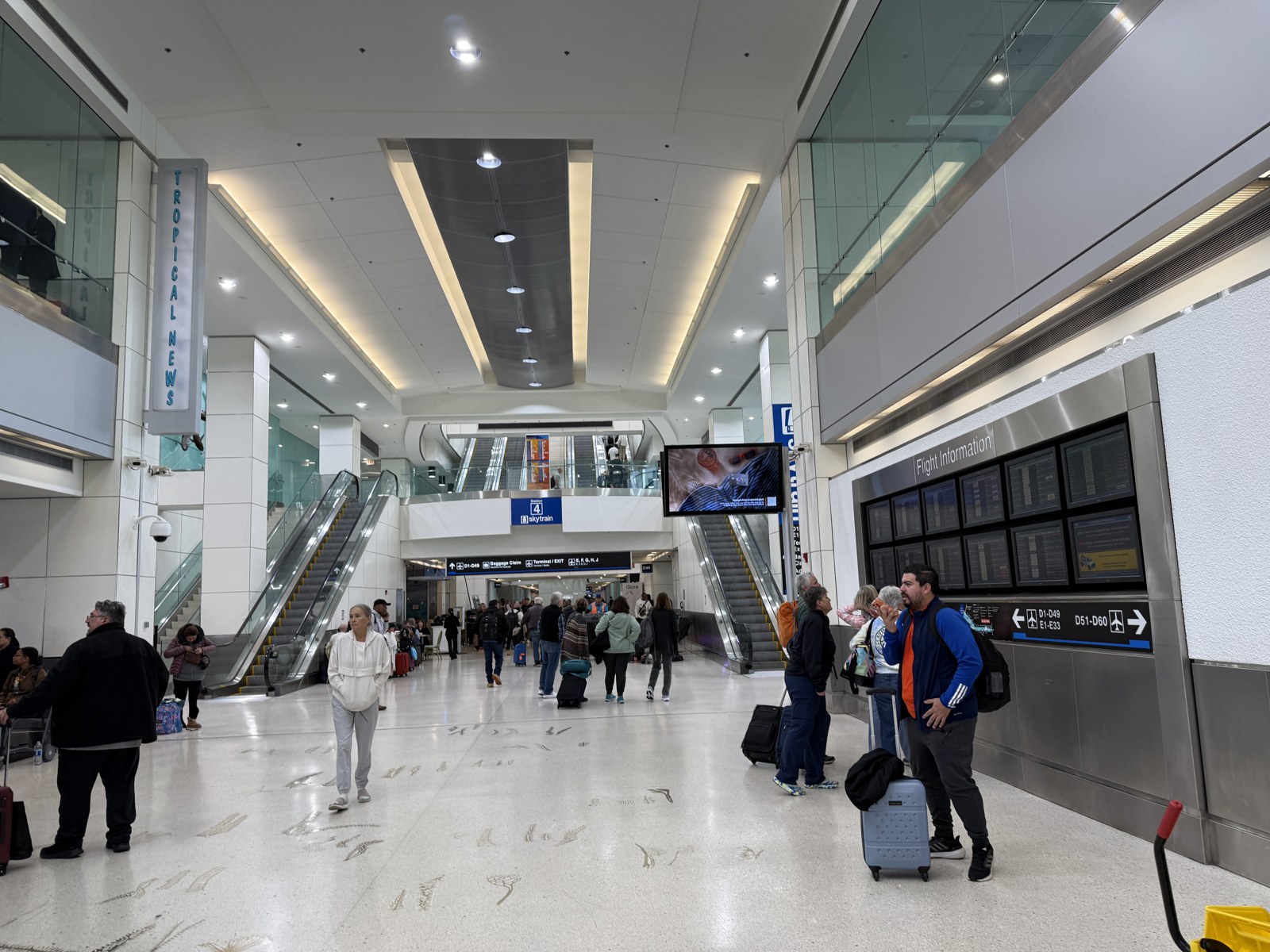
Photo · Concourse D hall, Skytrain Station 4, January 2026Wikimedia Commons
Photo: Dough4872, CC BY-SA 4.0, 2026, via Wikimedia Commons. Illustrative (Tier B), resized only.
Section 3
Carrier findings, at a glance.
Strength vs quality
3.0Two things decide mobile experience: how strong the signal is, and how clean it is. Strength is
whether the bars are full. Quality is whether all that energy is usable or tangled up with interference. Each
carrier lands in a different corner of that picture, which is the whole story of this venue in one figure.
Fig. 1 · Median 5G strength vs quality, venue-wide, per carrierSource · Ookla
Thresholds: strength healthy at −95 dBm or better; quality healthy at +10 dB or better. Hover a carrier for detail.
Fig. 2 · Gates in the healthy band, of 129, per carrierSource · Ookla
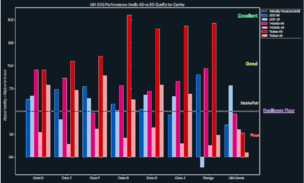
Fig. 3 · Signal quality by carrier and band, across venue zonesSource · Ookla
The dashed line is the figure's 5 dB reliability threshold, the level below which experience slips first; it is a lower bar than the +10 dB healthy-quality mark used elsewhere in this report. Bars above it carry load with margin. The three carriers are not weak in the same places. A neutral-host design has to lift all three at once.
3.1T-Mobilestrong, but noisy.
Carrier deep dive · 1 of 3 The attested DAS lead
100/129
Gates healthy on 5G strength · 78%
−93.1 dBm
Median 5G strength · best of three
+7.0 dB
Median 5G quality · weakest of three
2024
DAS contract expired · highest churn
T-Mobile delivers the strongest indoor 5G in the venue, with 100 of 129 gates in the healthy band and
a median of −93.1 dBm. That matches its position as lead carrier on the attested DAS. But quality is the weakest
of the three: a median 5G quality of +7.0 dB, with only two gates clearing the healthy mark.
Strong signal paired with weak quality is a specific problem, and it is not a coverage hole. The
device sees plenty of energy, but a good share of it is interference from cells competing on the same or
neighboring channels. The usual causes are a DAS and the outdoor network fighting for the same space at sector
edges, a stale cell plan, and antennas placed for a floor layout that tenants have since rearranged.
A design decision, not just a fix
Whether the new neutral-host system replaces this DAS outright or refreshes it is a real choice. Deciding well needs the cell-plan and sector-load data the carrier and Black Box hold, which is not in the public measurement layer. That is a named item in Sections 13 and 15.
3.2Verizonclean, and unrecorded.
Carrier deep dive · 2 of 3 The inferred path
+11.8 dB
Median 5G quality · cleanest, 82 healthy gates
128/129
Gates where Verizon is best on 4G
−84.3 dBm
Median 4G strength · healthy venue-wide
0/195
Healthy Verizon 5G tenants in Concourse D
Verizon is the most interesting profile in the data. Its 5G strength is mid-tier, with a median of
−97.3 dBm and 38 healthy gates, but its signal quality is the cleanest of the three, with a median of +11.8 dB and
82 healthy gates. Its 4G is healthy across the whole venue and best-serving at 128 of 129 gates.
Strong 4G, clean quality, mid-tier 5G, and no distinct path on record together make the strongest
case in the data for an independent in-building Verizon path that the airport graph does not capture. The
published scope explicitly names "legacy in-building systems, repeaters, BDAs, small cells, or standalone WSP
systems" and requires retiring them at cutover, which suggests MDAD already knows about paths the public records
do not show. Finding, confirming, and documenting this one before award is low cost and high value.
The one structural weak spot
Concourse D. Verizon's 5G falls off sharply there, and not one of the 195 tenants measured in D returns a healthy Verizon 5G reading. The five worst Verizon gates in the airport (D5, D7, D9, D11, D15) all cluster here at −101 to −103 dBm. That pattern is too clean to be chance, and it fits an independent path that simply does not extend into the American hub. Section 14 names Verizon 5G coverage in Concourse D as an acceptance test.
3.3AT&Ton the record, not in the measurement.
Carrier deep dive · 3 of 3 Attestation vs measurement
122/129
Gates with 5G at-risk · 95%
−101.6 dBm
Median 5G strength
11.4 dB
Outdoor-to-indoor drop · category medians
0
Gates in the critical band
The DAS record and the measurement disagree about AT&T, and this report states both. On paper, the
in-building system is a T-Mobile-led carrier consortium KG · 0.8, which would carry
AT&T. In the measurement, AT&T's 5G sits one band above critical across nearly the whole indoor footprint:
at-risk at 122 of 129 gates, median −101.6 dBm, with only three healthy quality gates. The good news inside the
bad: 4G availability is 99.9%, so subscribers are not losing service. They are running thin, not dark.
The evidence that AT&T's indoor path is not delivering is the jump at the building skin. Outside,
at curbside and landside tenants, AT&T's outdoor-category median signal is −85.9 dBm, which is strong macro
coverage. The same carrier on the same spectrum, measured across indoor tenant categories, sits at −97.3 dBm
(corrected rev 2: category-median basis).
An 11.4 dB drop crossing the wall is the signature of outdoor coverage leaking in. A hosted carrier on a
working DAS path does not show this signature; T-Mobile, on the same system, does not.
Reconcile before award
Two readings fit the data: AT&T is on the consortium paperwork but was not lit on the system, or its path is installed and materially under-delivering. Which one it is changes the RFP baseline, the remediation owner, and the cost. Resolving it needs the consortium's carrier list and AT&T's own sector data, and it is Recommendation 1 in Section 13. Either way, this measurement is the before picture, most of all in international concourses H and J, where AT&T's healthy share is 19% and 0%.
3.4Sub-1 GHz reliance
The share of a carrier's 4G tiles attaching below 900 MHz separates capacity-grade attachment from
coverage-grade survival. A carrier leaning on 700 and 850 MHz indoors is being carried by distant macro sites:
coverage without throughput headroom. Derived from the strongest-serving band tables in Appendix B
Derived.
36.4%
AT&T 4G tiles on sub-1 GHz · highest reliance
6.1%
Verizon 4G tiles on sub-1 GHz
4.6%
T-Mobile 4G tiles on sub-1 GHz · lowest
AT&T's reliance on coverage-grade spectrum is eight times T-Mobile's, which corroborates the indoor-path finding in 3.3 from an independent angle.
3.5RSRQ and channel quality
RSRQ corroborates the quality story because it is more interference-sensitive than strength alone:
Verizon's distributions sit several dB to the right of T-Mobile and AT&T at the median. Channel quality (CQI) shows
the same ordering, and CQI maps directly to modulation and coding selection, which makes it the closest thing to a
throughput proxy in an export that carries no throughput.
3.6Serving-cell volatility
We measured how often the strongest cell at a spot is not the cell actually serving it, a proxy for
handover churn. T-Mobile shows the highest churn of the three on both 4G and 5G, which is what you see when a
network keeps handing devices between overlapping cells: a stale cell plan rather than a coverage hole, and a
different remedy at a different cost. Verizon shows the lowest churn, reinforcing the picture of a stable
independent path.
Section 4
The view by zone.
Where coverage holds
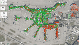
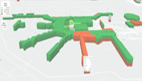
4.1Coverage is spatial, not uniform. Mapping the tile measurements onto the terminal footprint shows
where signal holds and where it thins. The weak zones line up with the carrier findings.
Fig. 4 · Coverage footprint, 2DIW Platform
Fig. 5 · Severity model, 3DIW Platform
Bands: healthy ≥ −95 dBm · at-risk −95 to −110 dBm · critical < −110 dBm. No 5G gate sits in the critical band on any carrier.
DAmerican hub · 51 gates
The bulk of mainline traffic. T-Mobile best-serving on all 51 gates. AT&T at-risk at every gate. Verizon is the weak spot here, with no healthy 5G tenant of 195 measured.
EInternational
Highest overall healthy share, but the lowest Wi-Fi presence at 43%, so cellular is the main lever in this concourse.
F18 gates
The universally weakest small concourse. Healthy shares run 36% / 20% / 9% on AT&T / T-Mobile / Verizon.
GDomestic
Among the stronger concourses on healthy share, with no carrier-specific anomaly. Even here, most gates sit at-risk for AT&T and Verizon.
HInternational · 13 gates
The one zone where Verizon wins best-serving 5G, on 7 of 13 gates. Highest Wi-Fi presence in the venue at 62%.
JLatin-American hub
Zero healthy AT&T gates inside, the weakest single carrier-by-concourse result in the venue. Home to the Copa, Avianca, and LATAM lounges.
4.3Cross-carrier concordance
The most important zone question for a procurement is not where coverage is weak but whose problem
the weakness is. A zone that fails for every carrier at once is a building, geometry, or propagation problem, and
the venue pays. A zone that fails for one carrier is a carrier-path problem, and the carrier's path pays. Sorting
MIA's zones by that split routes each fix to its owner Derived.
Fig. 6 · Gates by number of carriers weak, per concourseSource · Ookla
Weak is a gate median 5G strength below −95 dBm. Each bar is one concourse's gates split by how many of the three carriers read weak there; bars are shown as shares so concourses of different size compare directly. Hover a segment for counts.
Concourse F is the building problem. Nine of its 18 gates read weak on all three carriers at
once, the highest all-three share in the venue. No single carrier's path explains a failure that every carrier
shares; geometry, construction, and propagation do. That work is the venue's to scope and the venue's to fund,
which is why it carries its own recommendation rather than riding a carrier's remediation line.
Concourse H is the carrier problem. Eleven of its 13 gates read weak for exactly one carrier,
and no gate in H is weak for all three. Two of the three networks hold at those same gates, which rules out the
building and points at one path — AT&T's, consistent with Section 3.3. That cost belongs to a carrier's line
item, not to the venue's construction budget.
Concourse D shows the pattern in between: 37 of its 51 gates read weak for exactly two carriers, with
T-Mobile holding. A two-carrier failure is neither a clean building problem nor a clean single-path problem, and D
is where the acceptance tests in Section 14 do the most work.
Zone
Failure pattern
Reading
Concourse F
All three carriers weak
Building-class problem. Warrants its own propagation review, separate from any one carrier's path (Recommendation 4)
Concourse D
Verizon-specific
Carrier-path problem: the inferred independent Verizon path does not extend into the American hub
Concourses H · J
AT&T-specific
Carrier-path problem: AT&T healthy share 19% in H, 0% in J, while other carriers hold
Concourses E · G
No concordant failure
Strongest zones. Remaining weakness follows the venue-wide carrier pattern rather than the building
4.4Concourse D, the American hub, carries 51 of 129 gates and the largest single-airline
cluster in the venue. T-Mobile carries it; Verizon's five worst gates in the airport cluster here; AT&T is at-risk
at every gate. Any neutral-host design that does not name D-specific acceptance tests will be judged by its
weakest concourse.
4.5The international concourses E, F, H, and J each tell a different story: E strong on
cellular and thin on Wi-Fi, F weak on all three carriers, H the one Verizon win, and J the worst AT&T result in the venue,
sitting under the Latin-American hub carriers' lounges.
No dead zones, anywhere
Even in the strongest concourses, most gates sit in the at-risk band for AT&T and Verizon, and T-Mobile reaches majority-healthy only in D, E, and J. But no concourse has a single critical 5G gate on any carrier. There is no zone at MIA where 5G service is structurally lost. The job is raising quality, not building from nothing.
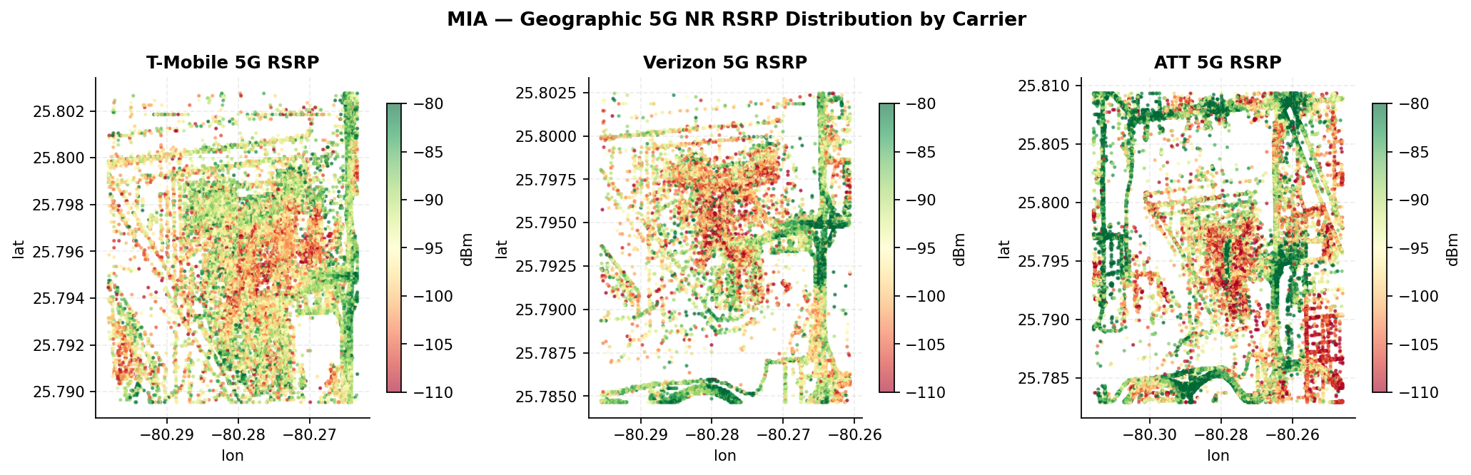
Fig. 11 · Geographic 5G NR RSRP distribution by carrier · airport footprintSource · Ookla
Every on-airport RF tile centroid, colored by 5G NR RSRP. The terminal core is the weakest area for all three carriers on this window; perimeter roadway tiles read strongest because they see the macro layer directly. VNIR report figure 17.
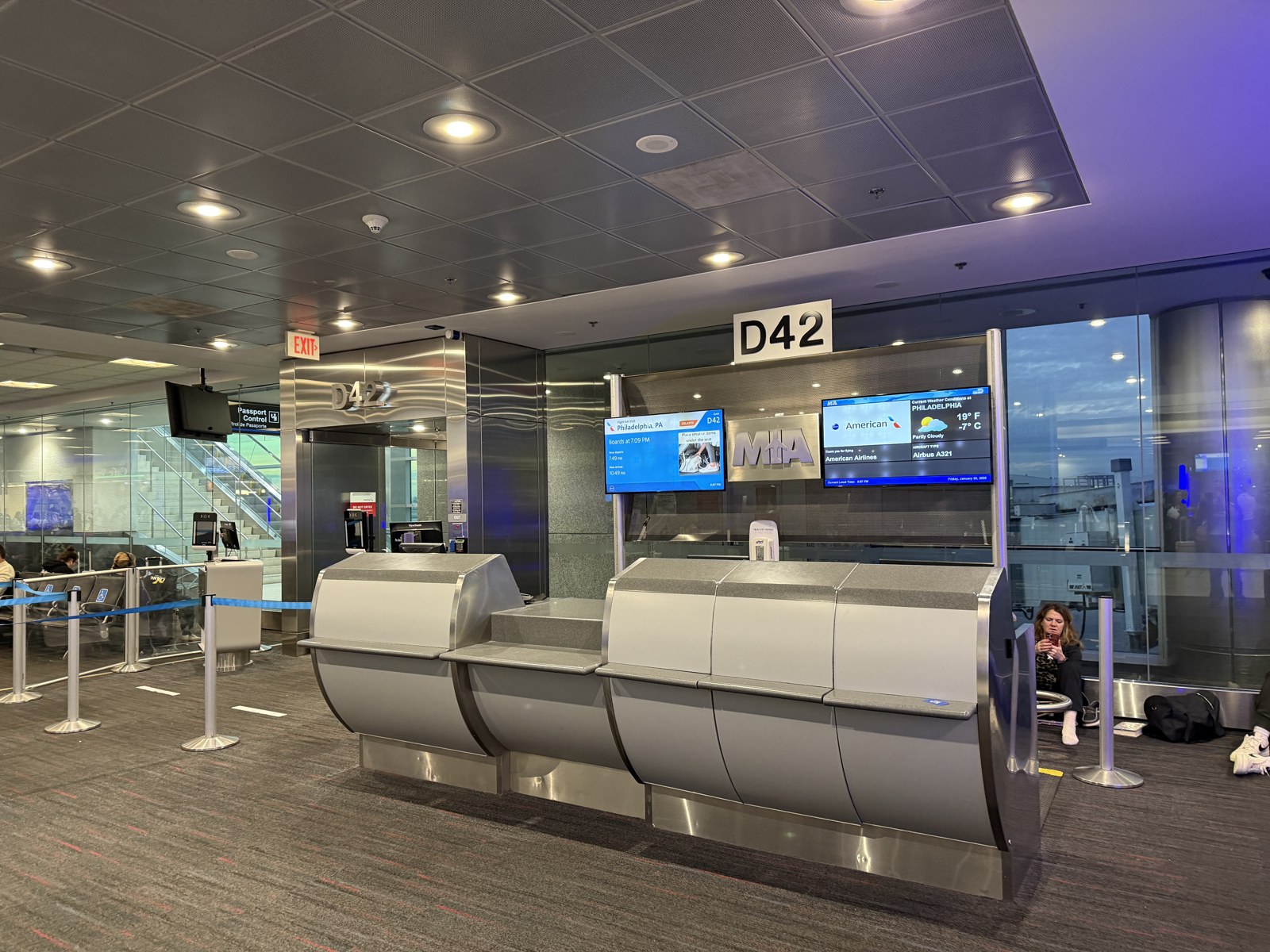
Photo · Gate D42, Concourse D, January 2026Wikimedia Commons
Photo: Dough4872, CC BY-SA 4.0, 2026, via Wikimedia Commons. Illustrative (Tier B), resized only.
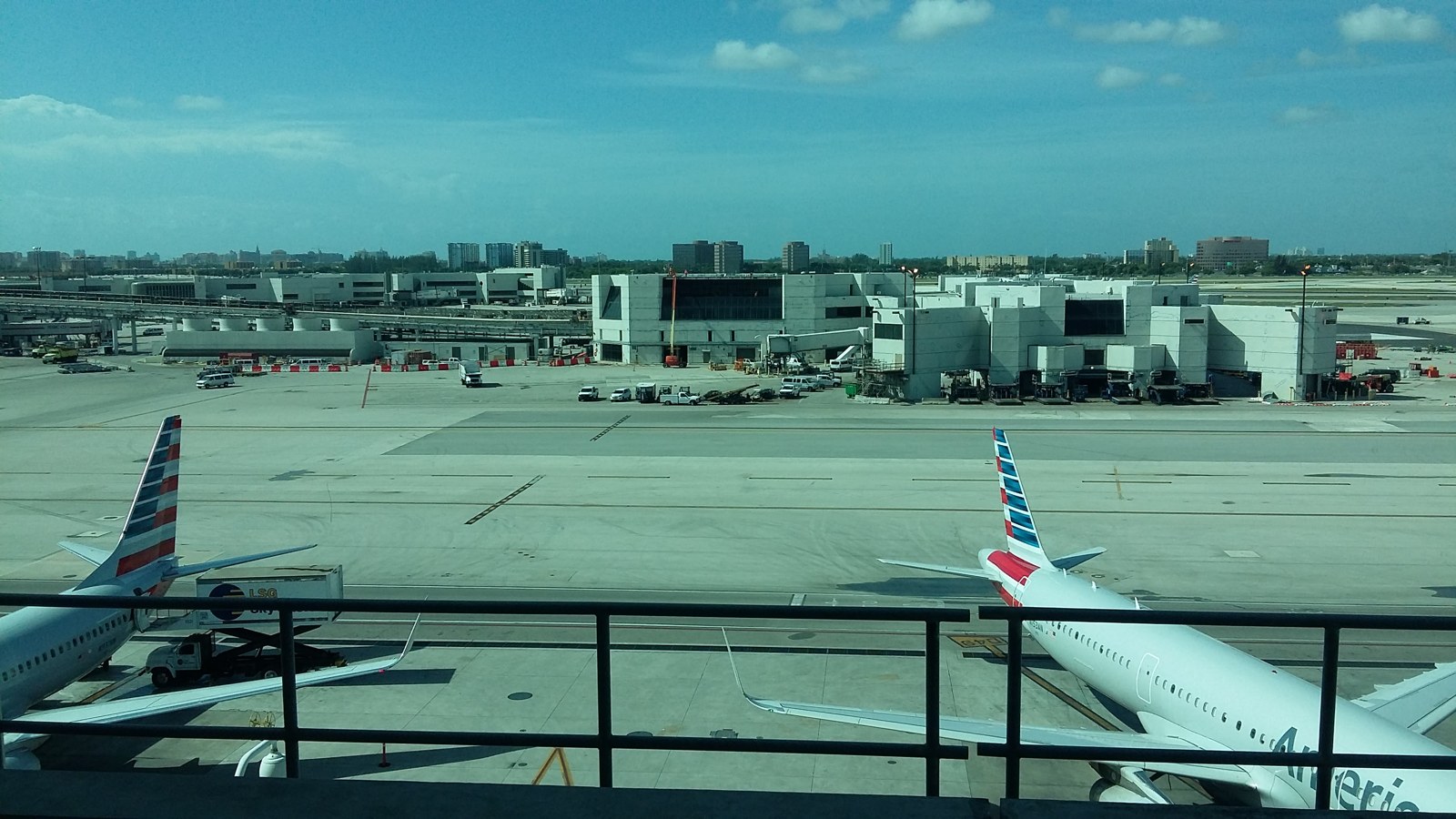
Photo · Concourse E and apron from Skytrain Station 4, 2016Wikimedia Commons
Photo: Xnatedawgx, CC BY-SA 4.0, 2016, via Wikimedia Commons. Illustrative (Tier B), resized only.
Section 5
Patterns at the tenant level.
Down to the storefront
5.1The measurement resolves to individual storefronts, gates, and lounges. Read together, the strength
and quality views give a clean summary of the whole carrier story: T-Mobile leads on signal strength at every
indoor category, Verizon leads on quality at every category, and AT&T leads only outdoors. Three carriers,
three strategies, all visible at the shop-door level.
5.2The indoor-outdoor tell. AT&T's gap between outdoor and indoor tenants is the largest of the
three by about 10 dB. T-Mobile and Verizon show much smaller gaps, because they have working indoor paths. This
edition proxies indoor and outdoor with tenant categories; the platform's native building-polygon mask replaces
that proxy at the next refresh (Section 15), which strengthens rather than changes the finding.
5.3By airline. Performance at a gate tracks the concourse more than the airline. American's gates see the
cleanest T-Mobile coverage. Delta-anchored gates in Concourse H show the clearest Verizon advantage. The
mixed international gates in H and J inherit the worst AT&T values in the venue.
5.4By brand. Coffee and quick-service brands with several MIA locations (Starbucks, Dunkin, Chick-fil-A,
Subway) cluster around the venue-wide carrier medians, which makes them a clean consistency check and a basis
for a per-store conversation with operations teams.
5.5Lounges. Of 15 measured lounges, T-Mobile is best-serving in 10, AT&T in 3, Verizon in 2. The Turkish
Airlines lounges in Concourse H hold the lowest AT&T readings in the airport, near −107 dBm. The Latin-American
hub lounges in Concourse J (Copa, Avianca, LATAM, United) sit between −100 and −106 dBm on AT&T. The full
per-lounge table, sortable, is Appendix C; the worst-20 tenant lists per carrier are Appendix A.
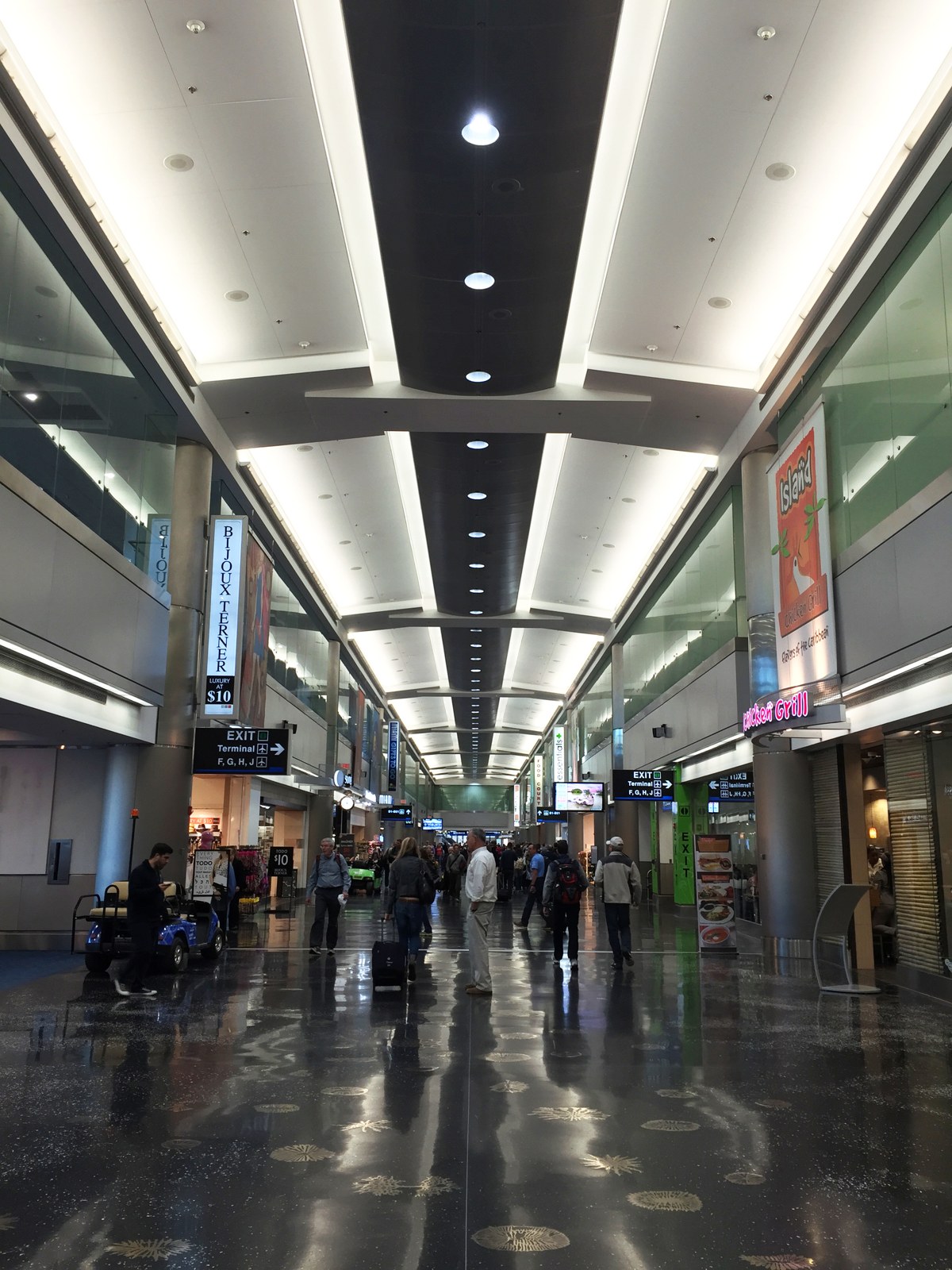
Photo · Concourse D retail corridor, 2016Wikimedia Commons
Photo: Russland345, CC BY-SA 4.0, 2016, via Wikimedia Commons. Illustrative (Tier B), resized only.
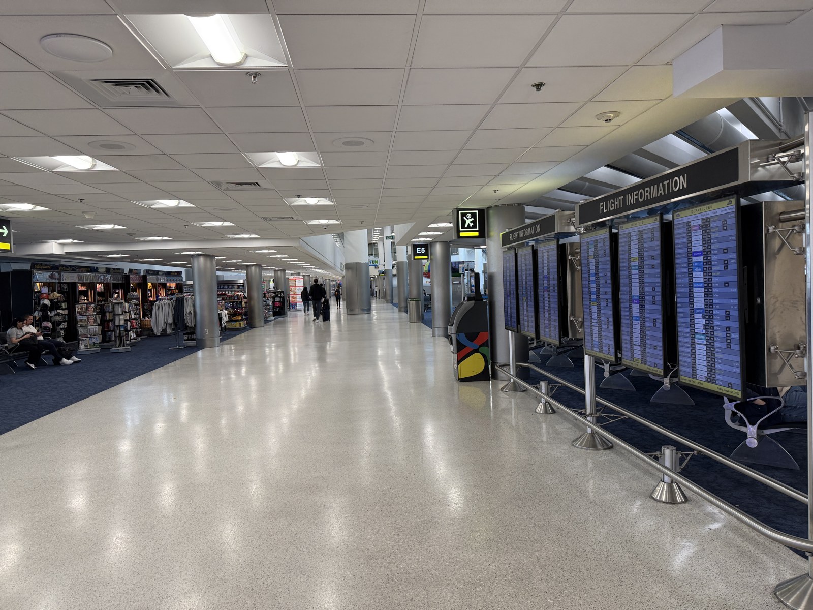
Photo · Concourse E near gate E5, January 2026Wikimedia Commons
Photo: Dough4872, CC BY-SA 4.0, 2026, via Wikimedia Commons. Illustrative (Tier B), resized only.
Section 6
Load and density.
Where it breaks under pressure
Coverage is a static property of a building. Density is what turns a marginal reading into a bad
afternoon: the same −97 dBm gate reads fine at 6 a.m. and fails during a bank of international departures. The
standard for this section is two views: unique-device density per zone (median and p95), and a density-weighted
weak share that ranks zones by passengers exposed under load rather than by dB alone.
Not in this export · stated, not estimated
The MIA export behind this edition predates the standard and does not carry the User Density layer, so this section states its method and ships no numbers. Density is a native layer at both bin and building level, so it needs a portal re-pull, not new fieldwork. It is the first item on the re-measurement plan in Section 14, and no density figure in this report has been estimated to fill the gap. One definition locked now: User Density counts unique devices over the measurement interval, deduplicated. It is not a concurrency figure and will not be described as one.
Usage intensity, which this export does carry
Density is missing; volume is not. The same export records Wi-Fi and mobile megabytes at each tile,
so zones can still be ranked by where traffic actually lands, provided the figure is read as observed usage and
never as a headcount. Concourse D carries roughly two and a half times the traffic of the next busiest zone on
both networks, which is what turns its at-risk AT&T readings from a coverage footnote into a capacity argument.
Fig. 7 · Observed Wi-Fi and mobile volume by concourseSource · Ookla
Megabytes observed across the twelve-month window, 2025-04-01 to 2026-03-31. This is traffic volume, not passengers and not devices. Hover a bar for the Wi-Fi share of that concourse.
Basis, stated · not a census
The usage fields in this export are carrier-panel-scoped. Each figure above is a sample-weighted blend across the three carrier panels rather than a total of every byte carried in the building. It supports ranking zones against one another and tracking the same zone across future windows. It does not support a claim about absolute venue throughput, and no such claim is made here or anywhere else in this report.
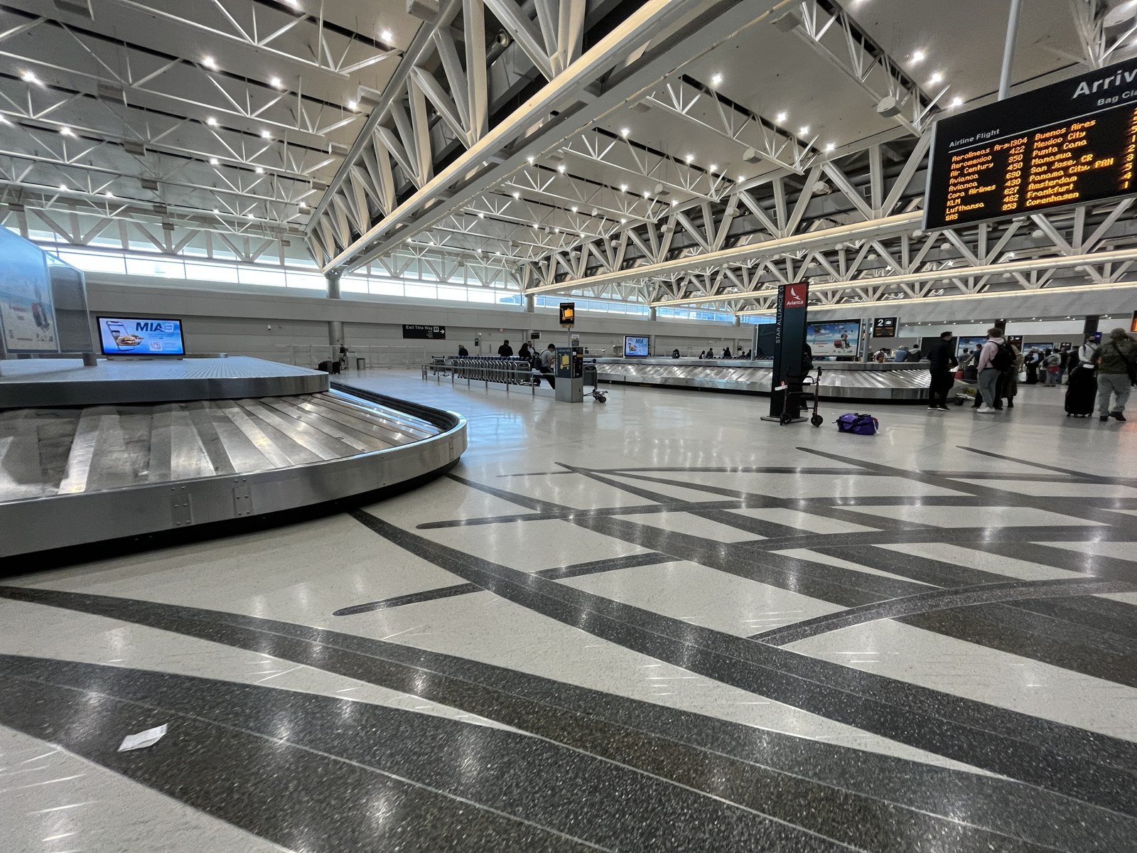
Photo · International arrivals baggage hall, January 2022Wikimedia Commons
The data shows Wi-Fi and cellular volume at each tile, but it cannot tie Wi-Fi use to a specific
carrier's subscribers. The standard's rule: venue- and zone-level offload shares are defensible because the
denominator is all networks; per-carrier offload is not derivable from this dataset and is not implied. Within
that rule the export answers both of the questions that matter here: how much traffic Wi-Fi already carries, and
where Wi-Fi reaches against where cellular is weak.
Offload · how much Wi-Fi already carries
Export-wide, 59.5% of observed megabytes move over Wi-Fi rather than over cellular,
computed as Σ Wi-Fi ÷ Σ all observed MB on the panel-blended basis stated in Section 6
Derived. Wi-Fi is not a supplement at MIA. It is already the majority path for data,
and any plan that treats it as a courtesy amenity is mispricing the asset. Zone by zone the split runs from 46.3%
in Concourse G to 62.2% in J.
Fig. 8 · Wi-Fi share of observed volume, venue and by concourseSource · Ookla
Wi-Fi share of observed megabytes, venue and zone basis only. Concourse rows cover tiles within 500 m of a concourse point and blend to 55.0%; the remaining landside and periphery tiles run 75.8% Wi-Fi, pulling the export-wide figure to 59.5%. Landside Wi-Fi dominance is itself a finding: away from the gates, roughly three of every four observed megabytes move over Wi-Fi. Per-carrier offload is not derivable from this dataset and is not shown, implied, or estimated anywhere in this report.
Presence · where Wi-Fi reaches
Wi-Fi usage is observed at 56% of measured tiles. The basis, stated so it can be checked: the
80,783 export rows deduplicate to 54,654 unique centroids, of which 44,106 report the Wi-Fi field at all (81%);
among those reporting tiles, 56% show usage above zero from any panel. This supersedes the rev-1 figure of roughly
53%, which rode a venue-clipped basis whose clip polygon was not retained (audit finding L1) and therefore cannot
be reproduced. The superseded number is named here rather than quietly swapped.
96–100%
Tenants with Wi-Fi observed, every category
F · H · J
Where augmentation leverage is highest
58–84%
Wi-Fi presence around measured lounges
At the tenant level the picture sharpens. Wi-Fi is observed at 96 to 100% of every category:
retail, food, lounges, services, admin, lodging. Volume is highest where passengers dwell and use bandwidth, at
food and lounge locations. This is the clearest sign in the data that the airport-owned, Boingo-managed network
reaches the tenants that matter most for experience. Passpoint matters here too: it hands supported devices
from cellular to Wi-Fi automatically and securely, which quietly masks cellular weak spots at the experience layer.
In the rooms where the worst carrier sits near −107 dBm, Wi-Fi presence runs above 70%, and that is
likely what keeps those rooms usable today for subscribers on the weak carrier. The per-lounge cellular-vs-Wi-Fi
table is Appendix C.
A real asset, worth sustaining
The practical point for leadership: MIA's cellular gaps are partly masked by an effective Wi-Fi network. That is a good operational reality to protect, not a reason to under-invest in cellular.
Section 8
The private wireless opportunity.
Coverage of the record
The airport graph records an active private 5G deployment at MIA, delivered jointly by FutureTech and
Black Box, the same Black Box that manages the DAS. The record shows it on CBRS spectrum and active since 2024
KG · 0.8, but its coverage zone and use cases are still unrecorded, and public
measurement does not characterize private networks. So from our vantage point it is present but unmapped. The
first task is attestation: documenting where it reaches and what it serves today. This section describes what the
record shows, not what exists.
The open DAS scope explicitly includes CBRS private wireless. That means the new neutral-host system
and any expanded private-network scope have to be reconciled in design. Either the new DAS absorbs private
workloads, the FutureTech footprint grows to cover them, or the two run as separate layers with documented
boundaries. Private networks at large hubs usually exist to serve workloads that public cellular and Wi-Fi
were not built for.
Workload
Why a private network fits
Who to coordinate with
Baggage handling instrumentation
Predictable latency, contained RF, isolation from passenger traffic
Facilities, BHS vendor
Ramp and ground-vehicle telematics
Outdoor airside coverage with controlled SIM provisioning
Airside Operations
Push-to-talk for ground crews
Guaranteed voice quality, independent of public carriers
Public Safety, ground handlers
Fixed cameras and IoT in back-of-house
Bandwidth without consuming public-carrier capacity
Facilities Maintenance
MIA Mover telemetry and CCTV
Stable connectivity along the guideway
People-mover operator
CBP secondary-inspection devices
Isolated network for federal device workflows
CBP IT, MDAD
Two hats to reconcile
Black Box is both the DAS manager and a private-network co-provider at MIA today. The new award will reshape that role, and the existing FutureTech and Black Box private network needs to be reconciled against the CBRS language in the new RFP.
Section 9
Spectrum and availability.
Which spectrum is working
The bands a carrier attaches to most often reveal which of its spectrum it actually puts to work
inside the building. Heavy reliance on low bands (700 and 850 MHz) means coverage-grade spectrum that carries
through walls but holds less capacity. Reliance on mid and high band means either a dedicated indoor source or
unusually strong outdoor penetration.
Serving-band tile counts
Fig. 9 · Strongest-serving 5G bands per carrier, by tile countSource · Ookla
T-Mobile leans on its 2.5 GHz mid-band 5G, which fits a real indoor DAS pushing capacity spectrum
through the building. AT&T's 5G barely registers indoors and its 4G leans on 2.1 and 1.9 GHz, consistent with
outdoor coverage reaching in. Verizon spreads across mid-band 5G and strong 2.1 GHz 4G, consistent with an
independent indoor path. Full per-carrier tables are Appendix B.
~100%
4G service availability, all three carriers
128/129
Gates where Verizon is the strongest 4G fallback
0
Critical-band 5G gates, any carrier
The reassurance line
Service availability is the simple question of whether any signal reaches a tile, and all three carriers show effectively universal 4G across the venue. In the worst graceful-degradation case, a passenger always has 4G. The 5G quality figures decide the experience above that floor.
Section 10
The carrier-asymmetry atlas.
Where the spread is widest
Some gates work well on one carrier and poorly on another. The spread between the best and worst
carrier at a gate, in dB, quantifies how much a passenger's experience depends on which network they happen to
carry Derived. The platform ranks the twenty gates with the widest spread; the worst
Verizon cluster (gates D5, D7, D9, D11, D15) is one face of it, and the AT&T readings in H and J are another.
Those gates matter in two ways: as worst-case examples for a stakeholder story, and as the acceptance-test point
list that feeds Section 14. The full ranked table ships with the next export refresh alongside its sample counts.
The cleanest success metric for cutover
A neutral-host design should make all three carriers perform alike at the same gate. Compressing the spread between best and worst carrier is the single clearest, most measurable success criterion for the new system. It is easy to test before and after, and hard to argue with.
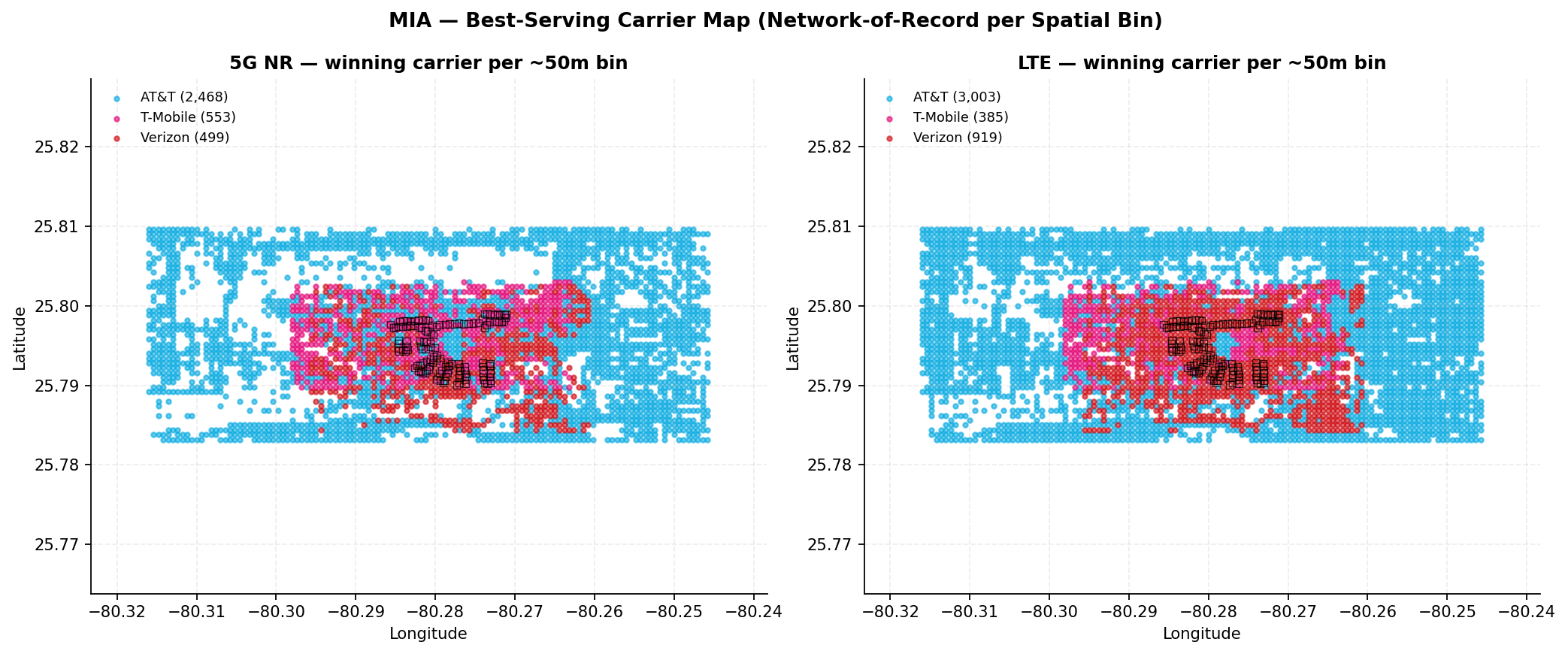
Fig. 12 · Best-serving carrier per ~50 m bin · 5G NR and LTESource · Ookla
Network-of-record view: which carrier reads strongest in each ~50 m bin. AT&T wins the perimeter where only its footprint reaches; inside the terminal core the 5G bins split between T-Mobile and Verizon, and the LTE bins go mostly to Verizon. Per-carrier footprints differ, so bins with a single reporting carrier default to that carrier. Figure from the sealed rev-2 Carrier Comparison Report.
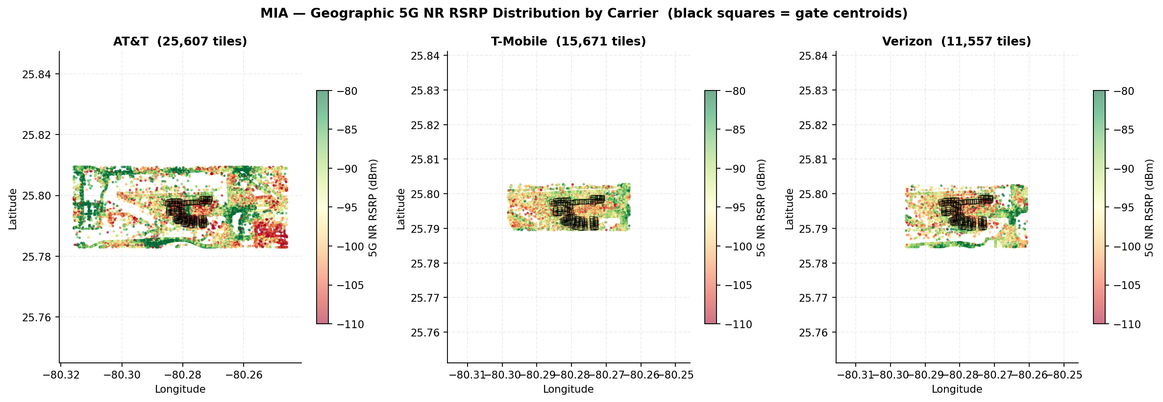
Fig. 13 · Tile-level 5G NR RSRP per carrier · full airport footprint · gate centroids markedSource · Ookla
Same color scale as Fig. 11, drawn at one common extent so footprint size can be compared directly. Tile counts per carrier are printed in each panel title. Figure from the sealed rev-2 Carrier Comparison Report.
Section 11
Federal and operational-critical tenants.
Small footprint, high weight
MIA's federal footprint in the public data is small: the two Customs and Border Protection
locations plus two landside police entries. The main FIS hall in Concourse D reads in the at-risk band on all
three carriers: AT&T −103.7, T-Mobile −98.7, Verizon −101.0 dBm. The Global Entry enrollment center in
Concourse J reads at-risk on AT&T at −101.3 dBm and T-Mobile at −95.4 dBm, with Verizon healthy there at
−94.4 dBm. The landside police entries sit in AT&T's outdoor-strong profile, near −82 dBm.
Operational-critical zone
Concourse
Reading
CBP main inspection hall (FIS)
D
At-risk on all three carriers · AT&T −103.7, T-Mobile −98.7, Verizon −101.0 dBm
Global Entry enrollment center
J
At-risk on AT&T (−101.3) and T-Mobile (−95.4); Verizon healthy at −94.4 dBm
Virginia Gardens police (landside)
Outdoor
AT&T outdoor-strong, ~−82 dBm
For any future conversation with federal stakeholders, the CBP zones are where a measurement-grounded
discussion starts. Customs processing runs through them, both read at-risk on AT&T and T-Mobile today, and they
are named locations the new design can be held to.
Section 12
The passenger-impact translation.
From RF to budget
dBm does not move a budget; passengers do. Crossing MIA's 26.6 million annual enplanements
KG record with each carrier's gate coverage classes translates the RF picture into the
unit an airport funds against Derived. One assumption, stated: boardings are spread
uniformly across the 129 gates Assumption. Concourse D alone holds 51 of them, so the
true AT&T and Verizon exposures skew toward the American hub, not away from it.
25.1M
Annual boardings at gates where AT&T 5G is at-risk · 122 of 129 gates
18.8M
Annual boardings at gates where Verizon 5G is below healthy · 91 of 129
6.0M
Annual boardings at gates where T-Mobile 5G is below healthy · 29 of 129
Read plainly: an AT&T subscriber boarding at MIA does so at an at-risk gate roughly 19 times out of
20. That sentence, not a coverage map, is the bridge between this report and a capital decision. The same
arithmetic re-run after cutover, on the same gates, is the return-on-investment measure.
Section 13
Prioritised recommendations.
Ordered by leverage · each names an owner
Eight actions, ordered by how much they change the procurement's outcome. Each is grounded in the
measurement record, with engineering inference labeled as such.
Reconcile AT&T's DAS attestation against its measured absence
The record puts AT&T on a T-Mobile-led consortium DAS; the measurement shows no delivering indoor path. Resolve which reading is true, not lit or under-delivering, before the RFP baseline is written, because it decides whether AT&T's line item is remediation or new integration.
Owner · MDAD with AT&T and Black Box
Find and document Verizon's legacy path before award
Verizon's clean quality and strong 4G point to an independent indoor system with no attestation, the class of asset the scope retires on cutover. Confirm and locate it, and specify how the new design absorbs its coverage.
Owner · MDAD with Verizon
Decide replace-versus-refresh for the incumbent DAS on data
Strong strength, weak quality, highest serving-cell churn: the incumbent system's pathology is a stale cell plan, not a coverage hole. The decision needs the cell-plan and sector-load data the carrier and operator hold.
Owner · MDAD with T-Mobile and Black Box
Give Concourse F its own propagation review
F fails for all three carriers at once, which makes it a building problem rather than a carrier problem. It may warrant a dedicated study separate from the main DAS design.
Owner · MDAD Facilities with bidders
Name Verizon coverage in Concourse D as an acceptance criterion
The largest single-airline cluster, 51 American gates, carries a Verizon 5G weakness. Section 14 writes the test.
Owner · MDAD procurement
Size cellular with Wi-Fi as a partner, not a zero
Wi-Fi is present at 96 to 100% of tenants and already backstopping coverage. Capacity planning should treat it as a coexisting layer, not assume a Wi-Fi-free baseline.
Owner · Bidders with Boingo
Reconcile Black Box's two roles against the CBRS scope
Black Box is both DAS manager and private-network co-provider. The award reshapes that, and the existing FutureTech and Black Box CBRS network should be reconciled against the new RFP's private-wireless language.
Owner · MDAD with Black Box and FutureTech
Hold the floor that already exists
There are no critical-band 5G gates today on any carrier. The new DAS should hold or improve that, not just chase healthy-band averages.
Owner · Bidders · written into Section 14
Section 14
Acceptance criteria and re-measurement plan.
The page that goes in the RFP
Proposed acceptance tests for the new neutral-host system, written against this report's baseline and
measurable with the same public layer that produced it. Thresholds are the platform ladder from Section 16; the
criteria themselves are recommendations, stated as such, for MDAD to adopt or tighten.
Criterion
Zone
Carrier
Threshold
Re-test
Verizon 5G lifted in the American hub
Concourse D
Verizon
Median 5G strength ≥ −95 dBm at D gates; healthy tenants > 0 of 195
Cutover + 90 days
AT&T indoor path delivering
H · J, then venue
AT&T
Healthy share ≥ 50% in H and J; outdoor-to-indoor drop collapses from 11.4 dB
Cutover + 90 days
Incumbent-quality pathology cleared
Venue
T-Mobile
Median 5G quality ≥ +10 dB; serving-cell churn no longer highest of three
Cutover + 90 days
Carrier-asymmetry spread compressed
Top-20 spread gates
All
Best-to-worst carrier spread materially compressed against the Section 10 baseline
Cutover + 90 days, then annually
The floor held
Every zone
All
Zero gates in the critical band (< −110 dBm), as today
Every re-measure
Concourse F lifted with the building fix
Concourse F
All
Healthy share above the pre-cutover 36 / 20 / 9% baseline on every carrier
Cutover + 90 days
Re-measurement plan. Re-pull the same tile layers on the same polygons at cutover plus 90 days
and annually after, adding the layers this edition lacks: User Density (Section 6), the native indoor mask
(Section 5), sample counts per bin, and the platform's date-range comparison, which paints improvement and
degradation directly and is the natural before-and-after exhibit for the board.
Section 15
Next layers to add.
Where the platform goes next
Next layer to add
What it would resolve
Source
User Density, bin and building
The load story in Section 6: median and p95 per zone, density-weighted weak-share ranking
Ookla portal re-pull
Native indoor / outdoor mask
Replaces the tenant-category proxy behind the donor-isolation diagnostic
Ookla portal re-pull
Date-range comparison
Before-and-after for the DAS cutover, painted improvement / degradation natively
Ookla portal
Sample counts per bin
An n column on every gate and tenant table, closing the crowdsource credibility gap
Ookla Imported Points Report
Cell site locations
Shows which macro sites feed the terminal, turning spillover inference into a map
Ookla portal
Indoor walk-test
Per-band performance inside jet bridges, the people-mover, and baggage corridors
Scanner survey
DAS cell-plan audit
Explains the incumbent strength-vs-quality gap and serving-cell churn
DAS operator, Black Box
Wi-Fi controller telemetry
Airtime, client density, and access-point-by-access-point capacity
Boingo, MDAD
Private 5G attestation
Characterizes the FutureTech and Black Box CBRS footprint
FutureTech, Black Box, MDAD
Verizon path attestation
Confirms and locates the apparent independent indoor system
Verizon
Public-safety coverage
Emergency-responder (NFPA 1221) posture and code implications
AHJ, integrator
Want the walk-through, gate by gate?
The platform holds per-gate detail behind every figure here: worst-20 tenants per carrier, complete band tables, the full lounge set. We'll walk your team through any zone in the venue.
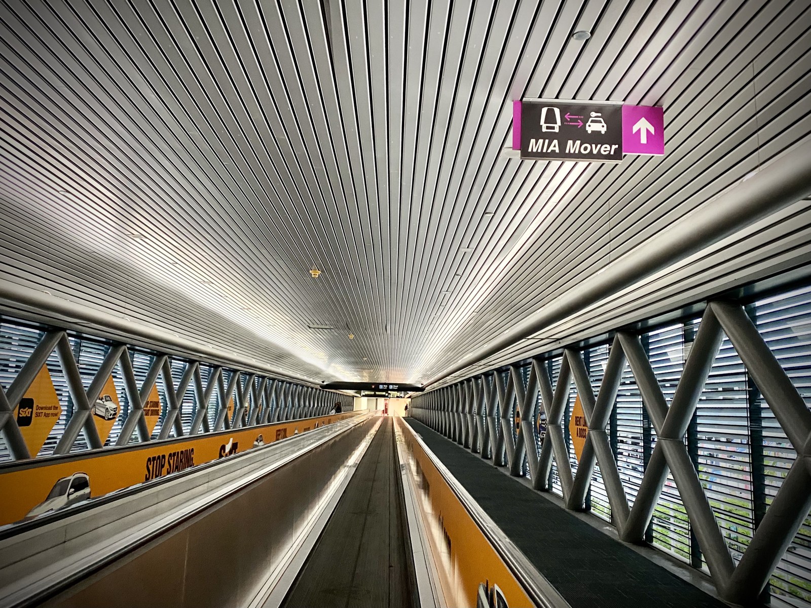
Photo · MIA Mover walkway to the Rental Car Center, 2021Wikimedia Commons
Photo: Sharon Hahn Darlin, CC BY 2.0, 2021, via Wikimedia Commons. Illustrative (Tier B), resized only.
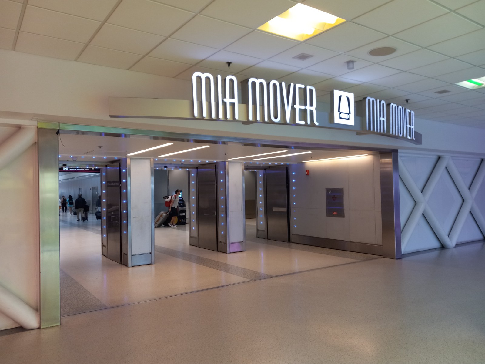
Photo · MIA Mover station entrance, terminal side, June 2024Wikimedia Commons
Photo: FunctioningMemberOfSociety, CC BY 4.0, 2024, via Wikimedia Commons. Illustrative (Tier B), resized only.
Section 16
Method, thresholds, confidence, and caveats.
The provenance discipline
Source and geometry. Ookla Cell Analytics tile dataset for MIA over a twelve-month window
(2025-04-01 to 2026-03-31), 57 days fresh at original issue and 136 days fresh at rev 2.2, which is beyond the
platform's 90-day default. That is disclosed rather than dressed: this revision re-states and corrects on the
same data window and is not a data refresh. Ookla documents bin geometry at roughly 10 × 10
meters; bins are summarized onto gate polygons from OpenStreetMap and tenant polygons from Google Places. Every
headline figure is a median; crowdsourced RF has a long tail, and means appear only in appendices, labeled.
Threshold ladder. 5G strength healthy ≥ −95 dBm, at-risk −95 to −110, critical below −110.
5G quality healthy ≥ +10 dB, at-risk 0 to +10, critical below 0. RSRQ healthy ≥ −10 dB. A venue-specified
threshold would override these and be named here; MDAD has not specified one.
Confidence and provenance. Facts from the airport knowledge graph rather than from measurement
carry an inline tag with the record's confidence (KG · 0.8). Derived figures computed
from given fields are tagged Derived; stated assumptions are tagged
Assumption. The carrier ordering throughout is strongest indoor first.
Caveats, stated precisely. Throughput, latency, and jitter exist in Cell Analytics as native
map layers, but they are not vector-exportable per test and are absent from the Imported Points Report, so the
per-gate pipeline in this report cannot carry them; zone-level reads are possible through polygon statistics and
are a next layer, not an omission of the product. Wi-Fi volume is not attributable to a specific carrier's
subscribers, so per-carrier offload is not implied. This edition's export is flat; the portal supports a 3D
view in 15-meter vertical bands, so floor separation is a next layer rather than an impossibility. Verizon's
indoor path is inferred from measurement, not confirmed by attestation. The AT&T finding in 3.3 is a stated
conflict between record and measurement, not a resolved fact. No value in this report was estimated or
invented; where a layer is missing, the section says so and ships no number.
Minimum sample rule. No comparative claim in this report rests on a cell below n = 30 tiles
or points. Cells smaller than that are reported as counts with their n attached; they are never ranked, never
described as stronger or weaker than another cell, and never folded into a median that carries a comparison.
Where a small cell is interesting enough to name, it is named as an observation and routed to the walk-test layer
rather than asserted as a finding.
Denominator discipline. A share means nothing without its basis, and gate-basis and
tenant-basis shares can diverge sharply inside a single concourse — AT&T in E, F, and H is the extreme case in
this dataset. Every zone claim therefore names whether it is computed over gates or over tenants and carries its
n. Where the two bases disagree, this report says so rather than publishing the more flattering one; the
walk-test layer in Section 15 is what reconciles them.
Service availability is a reporting-tile mean. Availability figures are means over the tiles
that report the field, not over every tile in the venue. AT&T reports it on roughly 73% of its tiles, so its
availability figure describes the tiles that answered. Absence of a reading is not evidence of no service,
and it is not read as such anywhere in this report.
Wi-Fi bases, locked. Two definitions govern every Wi-Fi figure here and hold for future
editions. Offload is Σ Wi-Fi ÷ Σ (Wi-Fi + mobile) observed megabytes, computed at venue and zone level
only, on a sample-weighted blend across the three carrier panels; per-carrier offload is not derivable from this
dataset and is never implied. Presence is the share of unique tile centroids reporting the Wi-Fi field
that show usage above zero — 56% at MIA, on 44,106 reporting centroids of 54,654 unique, deduplicated from 80,783
export rows. The rev-1 presence figure of roughly 53% used a venue-clipped basis that was not retained and is
superseded (audit finding L1).
Appendices
The gate-level detail.
Deep edition only
AWorst 20 tenant readings per carrier · 5G strength
Readings are median 5G strength (RSRP) at the tenant polygon. Sample counts (n) per tenant ship with the next export refresh via the Imported Points Report; they are not in this edition's export.
BStrongest-serving band tables per carrier
The interactive view is Fig. 9 in Section 9. Tile counts by band, both generations:
CFull lounge table · cellular vs Wi-Fi
Every measured lounge · click a column to sort
Per-carrier cells show median 5G strength / quality. Worst 5G is the lowest per-carrier median at the lounge. Wi-Fi presence is the share of nearby tiles where Wi-Fi traffic is observed. Dashes: too few samples on that carrier.